Making Manhattan plots as vector graphics in R with ggplot2
Manhattan plots are a widely used tool in statistical genetics to visualise the results of genome-wide association studies (GWAS). While they are simply scatter plots, the number of points to display is often in the millions and this makes them impractical to render as vector graphics in formats such as PDF or SVG. This is unfortunate as these formats are the gold standard for technical plots and are often requested by academic journals when submitting an article for publication.
This repo contains an R function to generate Manhattan plots with ggplot2 that can quickly be exported into a moderately-sized PDF file with ggplot2::ggsave (it can also be exported to SVG, although the resulting file is larger; I haven’t tested other vector formats). It is based on Holtz Yan’s excellent Manhattan plot function, produced for the R Graph Gallery, which I extended by merging overlapping points into single shapes to simplify the resulting output.
The key idea is to use software for processing and plotting geographic features (spefically, I use the sf R package) to convert each data point into a circle (a polygon in simple features language), merge overlapping circles into a single shape (perform a union operation) and finally plot these simplified shapes.
The function to generate these plots is provided in the fn-ggmanh_vec.R script and is named ggmanh_vec. Please see the beginning of this file for a description of the different options available.
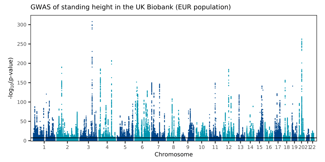
To illustrate how to use the function, I provide a simple reproducible example in the script make-manhattan-vec.R. I start by downloading summary statistics of a GWAS of standing height in European-ancestry samples in the UK Biobank which includes 12 million variants from Watanabe et al. (2019) (the article’s preprint is available on bioRxiv and the results can be downloaded from the GWAS Atlas). I then call ggman_vec to make a basic Manhattan plot and export it to PDF format with ggplot2::ggsave, obtaining the file ukb-height-gwas.pdf whose size is 751kB.
Click on image to see PDF version
Runtime
Making the example Manhattan plot mentioned above takes approximately 24min using four Intel Skylake 2.6GHz processors, each with 16GB of RAM. A simplified version in which we only plot points with p-value lower than or equal to 0.01 (approximately 1.2 million points) takes only 3min12s with the same resources and produces the file ukb-height-gwas-pv2.pdf. For comparison, a standard rasterised PNG plot takes 2min14s to make with a slightly modified (and not parallelised) version of Holtz Yan’s original function.
Dependencies
The following R packages are required:
In addition, the sf R package requires that the GDAL library be available on the system.
This code has been tested in R 3.6.2 (on CentOS 7.8.2003 with GDAL 3.0.2 installed) with doParallel 1.0.16, dplyr 1.0.6, foreach 1.5.1, ggplot2 3.3.3 and sf 1.0-0.